Postcards From a World on Fire
Creative and Technical Leadership
Postcards From a World on Fire, an article documenting the impact of climate change on every single country around the world, is the most technically and logistically ambitious project my department has produced.
My role for this project was overseeing design, development and production from conception to launch. I assumed managerial responsibilities in driving and coordinating cross-functional efforts.
Over 90 individuals across dozens of departments and disciplines were involved in the making of this article that took roughly 6 months to complete.
The project started with a broad conceptual ask from our editors: how do we show climate change’s effects all over the world in a way that feels fresh, engaging, urgent and grand?
I led a brainstorming session for the project using Figma.
After many ideas were sketched and discussed, we coalesced around one in particular. The idea was to create a multimedia feed of cards— one for each country, 193 total. We pitched it to our editors and after receiving the go ahead, began to pursue our vision.

Because the scope of the article was expansive, we needed design and engineering solutions to be as efficient as possible. The project would describe hundreds of countries through photo, video, audio, data visualization, animation and copy.
I oversaw developers in building out a quick low-fidelity prototype of the experience with placeholder content. This step was helpful in clarifying what we needed to solve for.
We quickly realized that our biggest engineering challenge was going to be loading everything quickly. The experience had to be as frictionless as possible for a global audience on desktop and mobile.
I set meetings with other newsroom engineers to learn how they had handled similar issues in other projects. We incorporated takeaways from those conversations back into our work and enlisted additional resources to tackle functionality. Through these efforts, we were able to dramatically reduce load time.
In addition to scoping out engineering requirements, we needed designs for the cards so that other teams could start filling them out with content.
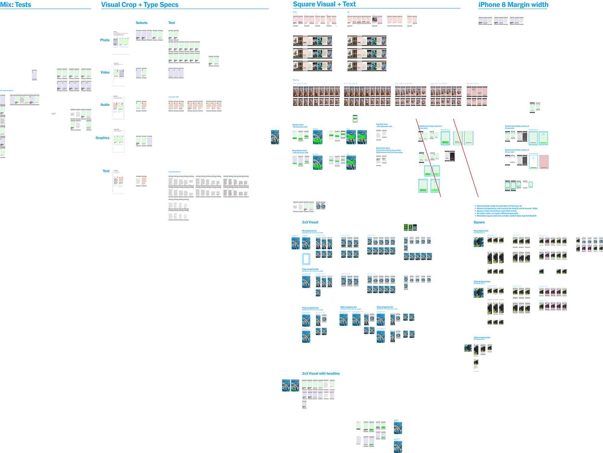
I oversaw designers in this effort. The image below is one page of many from our Figma files. It provides a glimpse at the testing we did to ensure card quality across desktop and mobile.

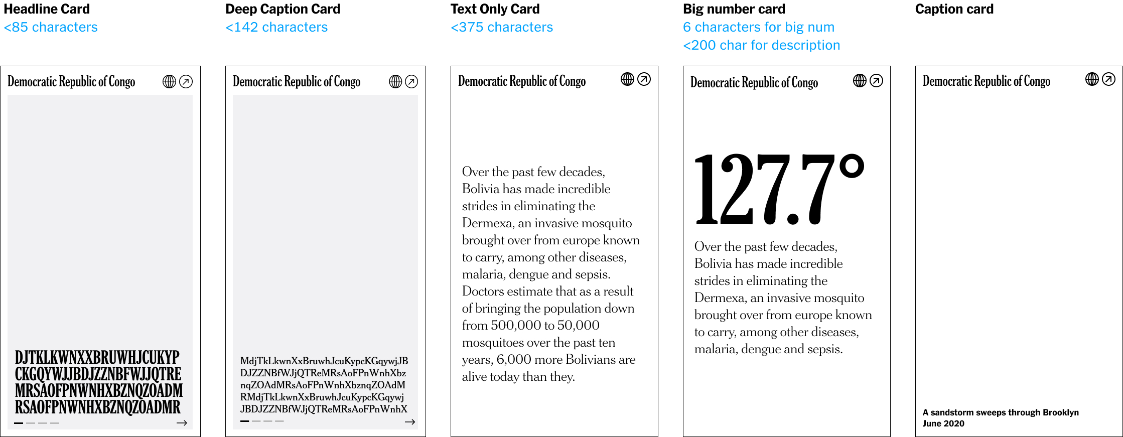
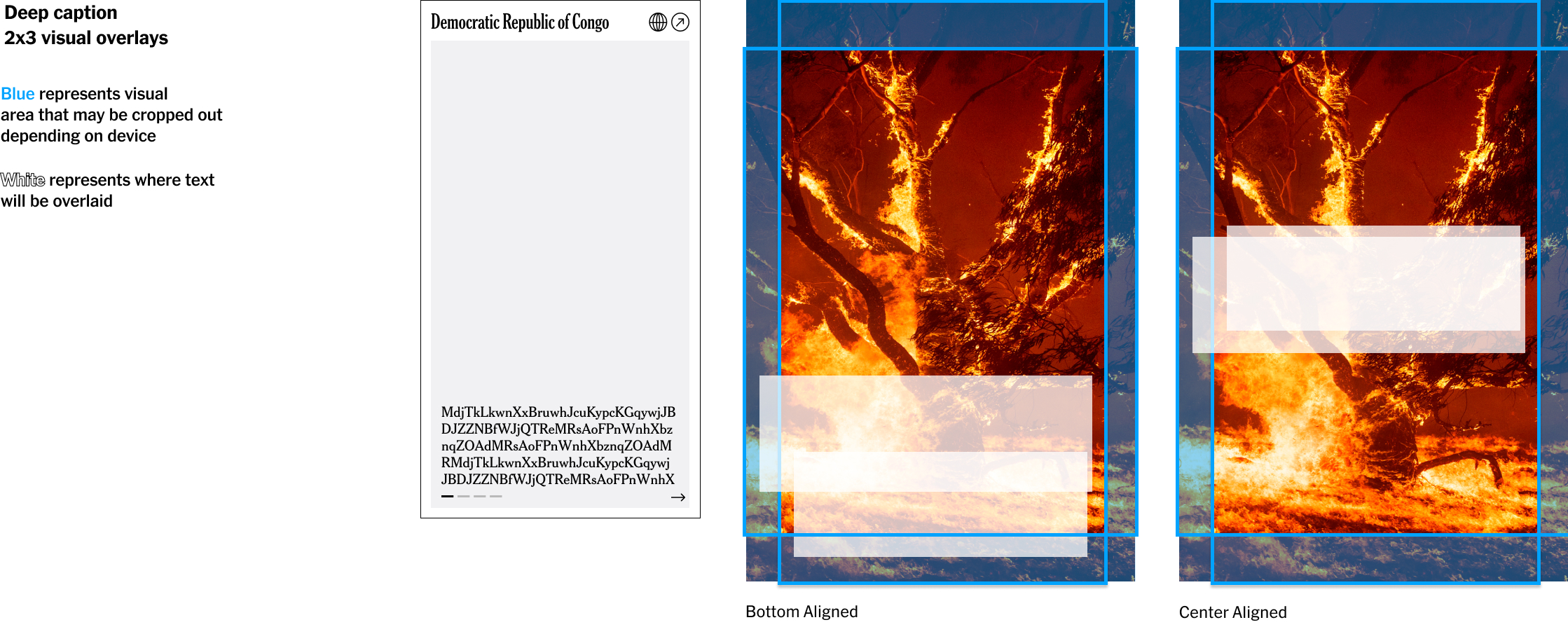
Ultimately we landed on this set of card designs and specifications, which we shared with our collaborators.


The next challenge was editing and migrating everything into the project. I made a color coded system in Figma and Google Docs to keep track of everything and streamline communications. Content was tagged with a color that changed when one step of the process was done so that stakeholders in the next step would be aware.
With these overview files in hand, I was able to outline deadlines, communicate them, set meetings, run meetings, check work, give feedback, and address issues as they emerged.
Once we had a solid pass at everything, I helped set up a user testing group. We were surprised by the feedback. A group of users landed on the first screen and didn’t know what to do. Others missed the UIUX clues entirely. It became clear that we needed to make the experience clearer for an audience accustomed to traditional reading experiences.
In response, we added instructional signals throughout the project, simplified the intro and made all the buttons a bright neon green so that they’d be less missable.
The project was widely viewed and won several awards for its scope and ambition.